CMYK vs Pantone: Which Colour Method to Use in Print
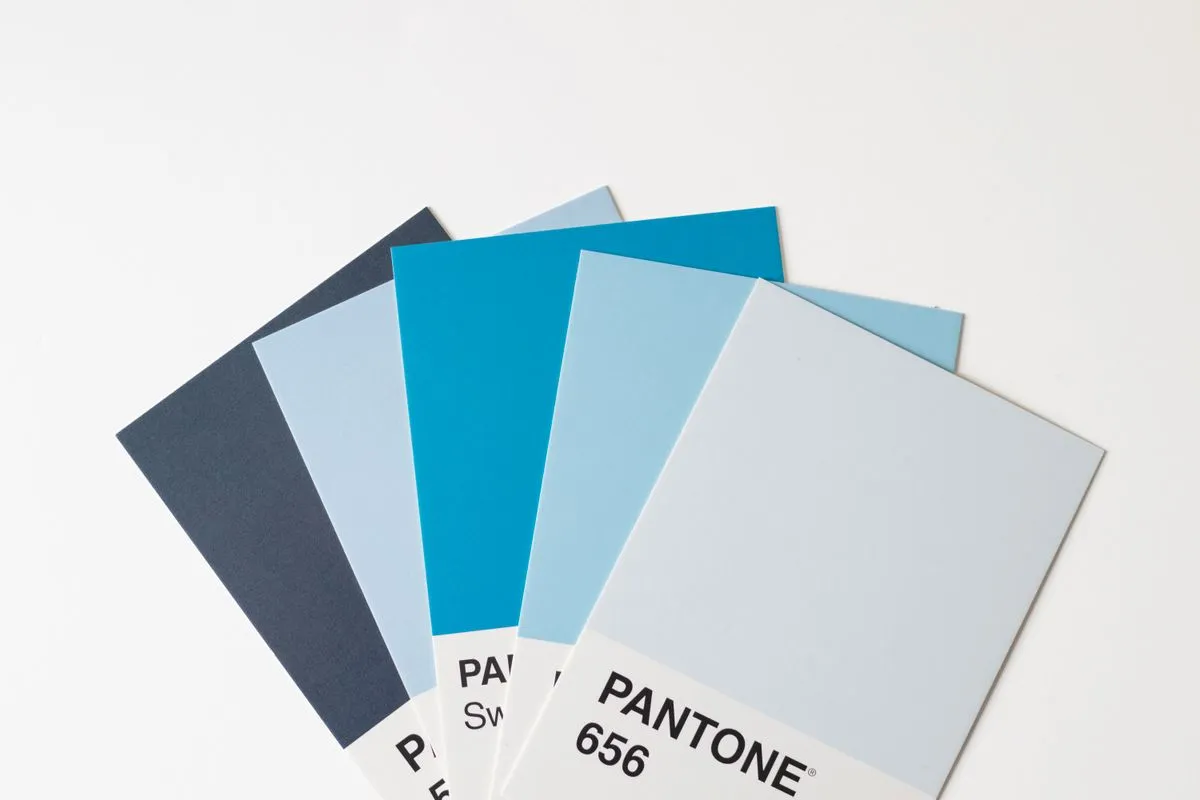
Quick answer: Use CMYK for photos and multi-colour designs: it mixes cyan, magenta, yellow and black inks and prints almost any image. Use a Pantone (spot) colour when one exact brand colour must match every time, such as a logo on packaging, because the ink is premixed rather than built from four inks. Many jobs use both.
Colour is where print and screen disagree most. This guide explains the difference and gives a rule for each job.
How the two methods work
| CMYK (process colour) | Pantone (spot colour) | |
|---|---|---|
| How it prints | Tiny dots of four inks overlap | One premixed ink per colour |
| Best for | Photos, gradients, full-colour layouts | Logos, flat brand colours, metallics |
| Colour range | Wide, but cannot reach some bright oranges, greens and blues | Includes colours CMYK cannot reproduce |
| Consistency | Varies slightly by press and paper | Very consistent when the ink is matched |
| Cost | Efficient for many colours | Each spot colour adds a press unit or ink |
Video: CMYK 4 Color Offset Printing, by Paul Hendley (third-party demonstration)
Which to use
- Photos and illustrations: CMYK.
- Logo with one or two flat brand colours on packaging: Pantone for the brand colour, CMYK for the rest.
- Business cards and flyers: CMYK is normally enough unless the brand colour is strict.
- Flexo and label printing: spot colours are common; see flexographic printing in Nepal.
- Metallic or fluorescent effects: these need special inks or foil, not CMYK.
Why your screen colour does not match print
Screens emit light in RGB. Print reflects light from ink on paper in CMYK. Bright screen colours often shift when converted. Convert to CMYK early, and view a proof, not the screen, as the final authority. See artwork file prep.
Paper changes colour too: coated paper keeps ink bright, uncoated paper absorbs it and looks softer. See the paper GSM guide.
Brand colour checklist
- Record your brand colour in CMYK, Pantone and RGB or hex
- Tell the printer which method each element uses
- Ask for a printed proof or swatch on the actual stock
- Keep the approved proof as the reference for reprints
- Re-confirm colour when you change paper or printer
Colour on different materials
The same colour value can look different on different materials and with different print methods.
| Material or method | What to expect |
|---|---|
| Coated art paper (offset, digital) | Bright, saturated colour |
| Uncoated paper | Softer, slightly darker colour because the paper absorbs ink |
| Kraft or brown board | Colours look muted and earthy; white ink or a white layer is needed for light colours |
| Plastic film (flexo, screen) | Colour depends on the ink and on a white base layer |
| Fabric (screen, DTF) | Ink or transfer sits on the fibre; dark fabric needs a white base |
| Flex and vinyl (wide format) | Strong colour, viewed from a distance |
On kraft paper bags and boxes, a light brand colour may print darker or greyer than on white paper. Ask for a sample on your actual stock. See paper bags vs plastic bags.
How to approve colour in four steps
- Send your colour values as Pantone references, CMYK values or a physical swatch.
- Ask for a proof on the same paper, finish and process as the job.
- Compare in daylight, not under a coloured lamp.
- Sign off and keep the approved proof for reprints.
Common colour problems and answers
| Problem | Why it happens | What to do |
|---|---|---|
| Screen colour looks brighter than print | Screens glow; print reflects light | Judge from the proof, not the screen |
| Reprint looks different | Different paper batch, press or ink | Keep the approved sample and ask the printer to match it |
| A bright orange or green looks dull | Some colours cannot be made with CMYK | Use a Pantone spot colour for that element |
| Two printed items do not match | Different materials or methods | Accept small variation or match on one stock |
| Gradient shows bands | Low resolution or limited tonal range | Use a higher-quality source and adjust the gradient |
Brand colour sheet
Make a one-page colour sheet so any printer can match your colours:
- Colour name (Brand Blue, Accent Orange)
- Pantone reference (for example, a coated reference)
- CMYK values
- RGB or hex for screens
- Where each colour is used
- Sample swatch from an approved print
Keep it with your logo files and send it with every order. See new product packaging checklist.
When exact colour matters most
Exact colour matters most on logos, food and cosmetic packaging, uniforms and products that are displayed together on a shelf. For one-off flyers or internal documents, a close match is usually enough. Decide which category your job is in before you pay for spot colours or press proofs.
Frequently asked questions
Is Pantone always better?
No. It gives a more exact match for one colour, but costs more for a photo-led job and adds a plate or ink.
Can CMYK match Pantone?
Often close, sometimes not. Ask the printer for the nearest CMYK build and a proof.
Do I need a proof?
For brand colours, yes. Colour on screen cannot be judged exactly.
Get your colours printed right
Tell Thankyooou your brand colour codes and the stock. See how to request a printing quotation.
Sources
- Pantone — official site — Pantone Matching System colour references.